说起前端交互,在如今的网页中弹出层随处可见,注意,弹出层与弹窗不同的是,弹出层有交互行为,有回调逻辑(部分没有)。很多js插件都封装了弹出层,比如比较好看的layui弹出层等。今天给大家分享一款仿苹果iOS系统的弹出层,多种模式选择,满足不同的交互情况。个人觉得弹出层原理简单,样式才是我需要的东西,所以我只学习它的样式,文末奉上完整代码。
先看下效果
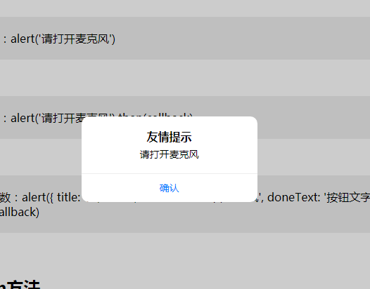
一款仿iOS系统效果的弹出层HTML源码
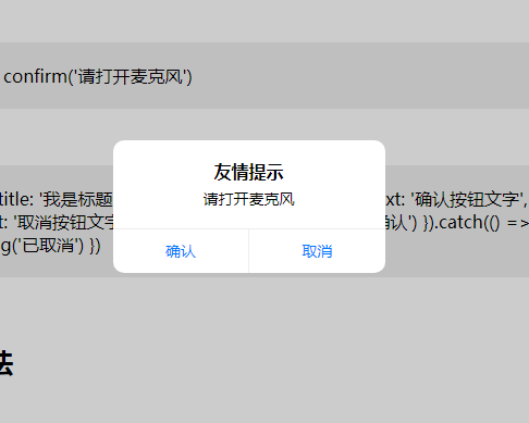
一款仿iOS系统效果的弹出层HTML源码
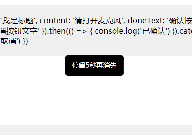
一款仿iOS系统效果的弹出层HTML源码
实现代码
css样式效果代码
复制
<style type="text/css">
	.ui__alert * {
  padding: 0;
  margin: 0;
}
.ui__alert .ui__alert_bg {
  top: 0;
  left: 0;
  width: 100%;
  height: 100%;
  z-index: 9998;
  position: fixed;
  background: rgba(0, 0, 0, 0.2);
  -webkit-animation-duration: 500ms;
          animation-duration: 500ms;
}
.ui__alert .ui__alert_bg.in {
  -webkit-animation-name: bgFadeIn;
          animation-name: bgFadeIn;
}
.ui__alert .ui__alert_bg.out {
  -webkit-animation-name: bgFadeOut;
          animation-name: bgFadeOut;
}
.ui__alert .ui__alert_content {
  text-align: center;
  position: fixed;
  min-width: 250px;
  max-width: 280px;
  z-index: 9999;
  background: #fff;
  border-radius: 10px;
  left: 50%;
  top: 50%;
  -webkit-transform: translate(-50%, -50%);
          transform: translate(-50%, -50%);
  -webkit-animation-duration: 500ms;
          animation-duration: 500ms;
}
.ui__alert .ui__alert_content.in {
  -webkit-animation-name: contentZoomIn;
          animation-name: contentZoomIn;
}
.ui__alert .ui__alert_content.out {
  -webkit-animation-name: contentZoomOut;
          animation-name: contentZoomOut;
}
.ui__alert .ui__alert_content .ui__content_body {
  font-size: 14px;
  padding: 18px;
  border-bottom: 1px solid #eee;
}
.ui__alert .ui__alert_content .ui__content_body .ui__title {
  margin-bottom: 5px;
  font-size: 16px;
}
.ui__alert .ui__alert_content .ui__content_foot {
  display: flex;
  justify-content: center;
  align-items: center;
}
.ui__alert .ui__alert_content .ui__content_foot a {
  font-size: 14px;
  color: #017aff;
  display: block;
  text-decoration: none;
  flex: 1;
  text-align: center;
  line-height: 40px;
  border-left: 1px solid #eee;
}
.ui__alert .ui__alert_content .ui__content_foot a:first-child {
  border-left: none;
}
.ui__toast_bg {
  top: 0;
  left: 0;
  width: 100%;
  height: 100%;
  z-index: 9998;
  position: fixed;
}
.ui__toast_text {
  line-height: 1;
  text-align: center;
  position: fixed;
  max-width: 200px;
  z-index: 9999;
  padding: 14px;
  color: #fff;
  background: #000;
  border-radius: 5px;
  left: 50%;
  top: 50%;
  font-size: 14px;
  -webkit-transform: translate(-50%, -50%);
          transform: translate(-50%, -50%);
}
@-webkit-keyframes bgFadeIn {
  0% {
    opacity: 0;
  }
  100% {
    opacity: 1;
  }
}
@keyframes bgFadeIn {
  0% {
    opacity: 0;
  }
  100% {
    opacity: 1;
  }
}
@-webkit-keyframes bgFadeOut {
  0% {
    opacity: 1;
  }
  100% {
    opacity: 0;
  }
}
@keyframes bgFadeOut {
  0% {
    opacity: 1;
  }
  100% {
    opacity: 0;
  }
}
@-webkit-keyframes contentZoomIn {
  0% {
    -webkit-transform: translate(-50%, -30%);
            transform: translate(-50%, -30%);
    opacity: 0;
  }
  100% {
    -webkit-transform: translate(-50%, -50%);
            transform: translate(-50%, -50%);
    opacity: 1;
  }
}
@keyframes contentZoomIn {
  0% {
    -webkit-transform: translate(-50%, -30%);
            transform: translate(-50%, -30%);
    opacity: 0;
  }
  100% {
    -webkit-transform: translate(-50%, -50%);
            transform: translate(-50%, -50%);
    opacity: 1;
  }
}
@-webkit-keyframes contentZoomOut {
  0% {
    -webkit-transform: translate(-50%, -50%);
            transform: translate(-50%, -50%);
    opacity: 1;
  }
  100% {
    -webkit-transform: translate(-50%, -30%);
            transform: translate(-50%, -30%);
    opacity: 0;
  }
}
@keyframes contentZoomOut {
  0% {
    -webkit-transform: translate(-50%, -50%);
            transform: translate(-50%, -50%);
    opacity: 1;
  }
  100% {
    -webkit-transform: translate(-50%, -30%);
            transform: translate(-50%, -30%);
    opacity: 0;
  }
}
 button {padding: 5px 10px;font-size: 16px; background: #ffc107; color: #fff;border: none}
</style>
js调用方式
复制
 document.getElementById('alert3').onclick = function () {
            alert({
                title: '我是标题',
                content: '请打开麦克风',
                doneText: '按钮文字'
            })
        }
封装好的js在文末的附件中,里面包含了完整的代码,大家可以放在本地看看效果,个人觉得移动端效果非常好。

评论 (1)